Showing posts with label Adobe Illustrator Tutorial. Show all posts

3D Logo


1.3D TEXT

Use the Type tool, type in “3D Logo”. Go to Effect >Warp > Arc and apply the following settings:

2.3D Extrude & Bevel

Then go to Effect > 3D > Extrude & Bevel and apply the setting as shown in the image below. You can drag around the cube to set the X,Y,Z rotation values. Set the Extrude Depth to 20pt.

3.Expand Appearance

Now go to Object > Expand Appearance to remove all effects and convert to paths. After the text object is expanded, Ungrounp the object by Object > Ungroup or press Ctrl+Shift+G. You probably need to do Ungroup 4-5 times in order to break the object apart.


4.Merge Paths

Select the round corner paths and merge them together by using the Pathfinder tool. Hold down Alt key, click on the Add to shape area to merge the selected paths. Repeat this step to clean up all round corner paths.


5. Apply Gradient

Select the top level paths and apply a yellow-green color gradient.


6. Eyedropper

Select the back(depth) paths, use the Eyedropper tool and click on the front paths. This will copy the gradient fill.

7. Darken

Keep the back paths selected, go to Gradient palette and adjust the gradient colors to a darker tone.


8. 3D Logo

You can use this technique to make 3D objects from any shape, text, etc.
Here are the steps:
  1. Apply 3D Extrude & Bevel effect
  2. Expand object
  3. Ungroup object
  4. Apply gradient
  5. Eyedropper gradient fill  

More…

Here are more samples I made using the same technique.


  • Digg
  • Del.icio.us
  • StumbleUpon
  • Reddit
  • Twitter
  • RSS

How to Make a Cartoon Style Cereal Box Logo in Adobe Illustrator CS3


Here is a look at what we will be making:


I have this problem every time I go grocery shopping: whenever I go down the cereal isle it takes me forever to pick out a box to buy. I’m so wrapped up in looking at the box design, especially those super tasty display logos! The other day I was caught staring at the new box of Lucky Charms drooling, not over the thought of marshmallowy moons and clovers, but over the beautiful new logo. So I set out to make one of my own in Adobe Illustrator. In the process I came up with some quick and easy techniques that look great! I am pleased to share them with you here.
If a real cereal logo designer happens by here, please give us insights!
I am using a Mac, and in this tutorial I will add shortcut commands, such as (cmd-F) for Paste in Front. PC users just substitute (ctrl) for (cmd) in most cases.

Step 1: Grab the Font

First thing to do is get a font to use. One great place to get free or buy quality fonts is from myfonts.com. The FREE font I grabbed for this tutorial is called   Mail-Ray-Stuff

Step 2: Type the Name

Using your new font, type out the name of your product.


 hen separate and modify each letter following these steps:
  1. Select the text
  2. In the Menu, go Type > Create Outlines.
  3. Right-click the text and select Ungroup (cmd-G).
  4. Using the Selection Tool(V) rotate, nudge and reposition each letter just slightly, to make the text look more active.           


Step 3: Create a “Plaque” for the Word to Display on

Now we need to make a big outline for your letters following these steps:
  1. Select the letters and group them up again by right-clicking > Group or (cmd-G).
  2. Copy it, and Paste Behind (cmd-B).
  3. Using the Stroke Palette, give it a big stroke, any color, and aligned to the center.


Lock the original text for now, by selecting it and going Object > Lock > Lock Selection or (cmd-2).
Then follow these steps:
  1. Select the outlined text
  2. Go Object > Expand
  3. Right-click the text and select Ungroup (cmd + shift + G)
  4. In the Pathfinder Palette choose Add to Shape Area
  5. Click Expand

Step 4: Patch Up the Inside

Let’s get rid of the white in the middle of the letters by following these steps:
  1. Draw shapes to fill in the open areas.
  2. Group them (cmd-G).
  3. Select them and the outline shape and choose again Add to Shape Area from the Pathfinder Palette.
  4. Click Expand.

Once you expand it, it will come to the front. To send it back where it was, right-click > Arrange > Send Backward (cmd-left bracket)

Step 5: Add a Gradient to the “Plaque”

Give it a vertical linear gradient by following these steps:
  1. Make sure nothing is selected (click on an empty area of the stage).
  2. Double-click the fill color icon in the Tools Palette, and enter a light blue color #29ABE2.
  3. Drag the color from the Tools Palette into the color Swatches Palette so we have it for later.
  4. Repeat, adding a darker blue #0071BC to the Swatches Palette.
  5. Select the plaque (can I just call it that now? mkthx).
  6. Activate the Gradient Palette, and drag the light blue swatch from the Swatches Palette onto the left side of the gradient, and the dark blue onto the right.
  7. Using the Gradient Tool(G) drag from the plaque top to bottom, to perfect your gradient.


Step 6: Add Another Text Outline

Building upward from our base layer, let’s add another text outline by following these steps:
  1. Go Object > Unlock all (cmd-option-2) to select the original text
  2. Copy it and Paste Behind again (cmd-B)
  3. Using the Stroke Palette, give it a stroke of any color besides black, so you can see it (I used red). Aligned to outside is fine.
  4. Go Object > Lock > Lock Selection (cmd-2) on the original black text again, to preserve it for later.

Step 7: Color the Text Outline

Now let’s give your new text outline a light blue color by following these steps:
  1. Select the outlined text and go Object > Expand Appearance, checking fill and stroke in the dialogue.
  2. Right click > Ungroup (cmd-shift-G)
  3. In the Pathfinder Palette, choose Add to Shape Area, like we did for the plaque.
  4. Click Expand
  5. Fill it with a light blue #88DBF2 (drag this color into your Swatches Palette to save it).


Step 8: Make the Text 3D!

One sweet effect in Illustrator CS3 is the Effect > 3D Tool. Let’s apply it to our text by following these steps:
  1. Unlock the original text Object > Unlock All (cmd-option-2) to select it, and fill it with any color for now, I chose red.
  2. Go Effect > 3D > Extrude and Bevel
  3. Choose options similar to the following, feel free to play around here, making sure to check Preview to see what you’re doing.


Step 9: Color the 3D Letter Faces

Your 3D text might look pretty good the way it is, but I bet we can make the colors even nicer. To edit the colors we will need to break the 3D text into individual shapes. To do that follow these steps:
  1. Select the 3D text and go Object > Expand Appearance
  2. Right click > Ungroup (cmd-shift-G). That will separate each letter block.
  3. We want to get at just the face of each letter though, so select all the letters again and right click > Ungroup once more.
  4. Now select all the letter faces and group them, and give them a vertical linear gradient color bright red #FF0000 on top to dark red #7A0009 on bottom


Step 10: Color the 3D Letter Blocks

There’s not quite enough shadow on what’s behind the letter faces, so let’s darken the block part of each letter:
  1. Select all the pieces of the letters besides the faces. Zoom in and make sure you get them all; there might be some that are hard to see.
  2. Group them (cmd-G)
  3. Grouping them will cause them to move in front of the letter faces, so right click > Send Backward (cmd-left bracket) to place them back where they were.
  4. Fill them 3D with a darker red #44000A

Step 11: Create Highlights

The real magic in a good logo is in the details. We can really sharpen this one up by adding highlights to the letters. Here is a relatively quick and easy way to make them, but is our most complex set of steps thus far:
  1. Copy the letter faces (only) and Paste in Front (cmd-F).
  2. Nudge the copied faces to the right a few (2) taps.
  3. Select both sets of letter faces and in the Pathfinder Palette choose Subtract from Shape Area, then Expand.
  4. Aack! where did my text go? Don’t worry, It’s still on your clipboard so just Paste Behind (cmd-B).
  5. Select your highlights and fill them with our bright red #FF0000.


Step 12: Adjust the Highlights

Pretty close but not quite done! With the Direct Selection Tool (Y) select the points of any awkward highlights and adjust them to line up correctly.


Awesome! The main part of your logo is done, now let’s add more juicy text to describe your product

Step 13: Add Secondary Text

Well? What kind of cereal is it? Loops, Crisps, Nuggets, or what? Let’s go with PUFFS! Start it out just like the beginning:
  1. Type the word “Puffs” using the same font.
  2. go Type > Create Outlines.
  3. Right-click > Ungroup (cmd-G).
  4. Rotate, nudge and reposition each letter.


Step 14: Give it a Puffy Stroke

This one needs a plaque to sit on as well, but we’ll make this one rounded and puffy looking:
  1. Group the letters up again, Copy and Paste Behind (cmd-B). Lock the PUFFS text on top (cmd-2).
  2. Give it a big stroke, any color for now. Align the stroke to the outside and make it big enough to fill the inside.


Step 15: Color the Puffy Plaque

Alright this one needs a background gradient color too. Let’s give it the same color as the other plaque by following these (familiar) steps:
  1. Go Object > Expand Appearance, right click > Ungroup, and in the Pathfinder Palette choose Add to Shape Area, then Expand, like we did for the first plaque.
  2. Choose the eyedropper tool (I) and click the other plaque to copy its gradient colors.
  3. Use the Gradient Tool (G) to adjust the gradient to your liking.

Step 16: Puff out the Top PUFFS Text

Now we can style the original PUFFS text. Let’s add a bit of roundness to it:
  1. Unlock the text. Object > Unlock All (cmd-option-2).
  2. Give it a 1pt. stroke, aligned to the outside, with rounded corners
  3. Then do our familiar step: Object > Expand Appearance, right click > Ungroup, and in the Pathfinder Palette choose Add to Shape Area, then Expand. 

Step 17: Create Puffy Highlights

Before we get to coloring the text, let’s make the highlights. The technique here is similar to the other highlights, but we will go an extra few steps:
  1. Copy your new PUFFS shape and Paste in Front (cmd-F).
  2. Nudge it to the right one or two taps.
  3. Caution: when you nudge the word over it may overlap the letter to its right. Use the Direct Selection Tool (Y) to adjust the shape on top so it doesn’t overlap.
  4. Select both PUFFS shapes and in the Pathfinder Palette select Subtract from Shape area, then Expand.
  5. Use the Direct Selection Tool to delete any little straggling pieces.


Step 18: Refine the Highlights

First of all Paste in Back (cmd-B) your copied PUFFS text and fill it with white. Now we can work on the highlights a bit more and get rid of the over-hanging top portion:
  1. Nudge the highlights over to the right one tap.
  2. Copy the PUFFS text and Paste in Front (cmd-F), then Right-Click > Arrange > Bring to Front (cmd-shift-right bracket).
  3. Nudge the text down one tap
  4. Select the text and the highlights and in the Pathfinder Palette choose Intersect Shape Areas, then Expand.

Step 19: Refine the Highlights More

Fill the new highlight shape to see what you have, but we will repeat this step to remove the over-hanging bottom portion of your highlights:
  1. Copy the PUFFS text again and Paste in Front (cmd-F), then bring it to the front.
  2. Nudge the text up one tap this time.
  3. Select the text and the highlights and in the Pathfinder Palette choose Intersect Shape Areas, then Expand.
  4. Now you can color your finished bevel effect with the light blue #88DBF2.


Step 20: Position PUFFS in the Logo

Lookin’ good yet? Let’s get PUFFS in the logo:
  1. Select the blue plaque behind PUFFS and give it a white stroke, aligned to the outside, and about 5pt.
  2. Position PUFFS the way you like under your logo.

Step 21: Warp the Logo

When you are happy with the logo so far, select both words and go Object > Warp > Make with Warp and give it an Arc with about a 13% Bend, like the image below. Make sure to check Preview to see your changes.


Step 22: Finishing Touches

Your logo is done!
Go ahead and add some background elements if you like. I made some clouds and rays but I encourage you to come up with your own!


Thanks for following my tutorial! I hope you learned lots from this.
How did you like this tutorial? Was it easy to follow? Tough to follow? Did I screw anything up? Your feedback is gold!

  • Digg
  • Del.icio.us
  • StumbleUpon
  • Reddit
  • Twitter
  • RSS

Glossy Button


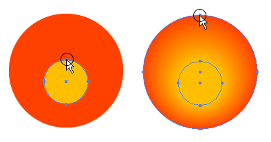
1. Create the Circle Shapes

First create a circle path and fill it with orange color. Then Copy (Ctrl+C) it and Paste in Front (Ctrl+F). Scale down about 40% and drag it slight below the center point of the orange circle.


2. Blend Tool

Select the Blend Tool, click on the top edge of the yellow circle and then click again on the top edge of the orange circle. Or you can blend them by selecting both circles, go to Object > Blend > Make (Ctrl+Alt+B).

3. Add Final Light Reflection

Make an oval path and fill it with black & white Gradient and place it on top of the circles. Note if your color setting is CMYK, make sure the black for the gradient is full black(C=100, M=100, Y=100, K=100). With the oval path selected, go to Transparency pallate, select Screen Blend Mode. If your Transparency is not showing, go to Window > Transparency or press Ctrl+Shift+F10.

Advantages

There are serveral advantages to create this glossy button with Illustrator than Photoshop:
  1. It is vector, which mean it is scalable.
  2. It is easier and faster to make this with Illustrator (less steps).
  3. Easier to change colors, just need to fill the circles with different colors.

  1.  

  • Digg
  • Del.icio.us
  • StumbleUpon
  • Reddit
  • Twitter
  • RSS

Illustrator Live Trace


A reader raised the question why I don’t use the Live Trace instead of tracing the sketch with the Pen tool. It’s simply because the lines of my sketch aren’t ‘clean’ enough to make it work with Live Trace. The outcome depends a lot on your orignal.Not that you can’t do magic tricks with this tool, of course you can.
If I traced my pencil drawing first with a thin black marker and scanned this version of the image, it might have been perfect to use Live Trace instead. I simply wanted to show how the Pen tool works and how I draw most of my illustrations, that was the point of the movie.
If you are in the mood for some experimenting with the Live Trace tool then I could give you some info that might help you. In some case (most cases?) you'll get a pretty result already without tweaking too much on the settings. Take for example the picture below. I've just used the 'Photo High Fidelity' Live Trace option which gave this result (in a blink of the eye).


However if you're after more advanced control on how Live Trace will trace your image then this info can come in handy. After selecting your image you go to Object > Live Trace > Tracing Options. This will popup the Tracing Options windows which gives you the possibility to tweak with the settings. When you click the Preview checkbox you'll see the immediate effect on your image, unchecking it brings back the original image. So you'll need this while experimenting.


  • The lower the number you set in the 'Path Fitting' option the tighter the image will be traced. But make sure it's not too low otherwise you could get a jaggy effect. The higher the number the smoother the effect but you might loose detail in the process. So experiment with this setting.
  • The 'Minimum Area' option defines the minimum area that will be traced, which will help to avoid little specs of being traced. For example if you use 12px as minimum area, a 11px or smaller area won't be traced.
  • The 'Corner Angle' option sets the sharpness of corner angles. The lower the number, the sharper the corners.
If you go to Object > Live Trace > Expand the image shows the paths and you can still tweak and edit whatever you like, but don't forget to ungroup the object.
A very extended white paper(PDF) about live tracing can be found on the Adobe website: Creating Vector Content Using Live Trace

  • Digg
  • Del.icio.us
  • StumbleUpon
  • Reddit
  • Twitter
  • RSS

Explore 3D effects

In this tutorial, you’ll use two-dimensional shapes as the foundation for creating three-dimensional objects in Adobe® Illustrator® CS2. Using the 3D effect, you can control the appearance of 3D objects with lighting, shading, rotation, and other properties.
There are three ways to create a 3D object:
  • Extrude and Bevel—Uses the Z axis to give a 2D object depth by extruding the object. For example, a circle becomes a cylinder.
  • Revolve—Uses the Y axis to revolve an object around an axis. For example, an arc becomes a circle.
  • Rotate—Uses the Z axis to rotate 2D artwork in 3D space and change the artwork’s perspective.
    illcs2mr3d_1
    Extrude and Bevel, Revolve, and Rotate

Use the 3D Extrude effect

In this lesson, you will create a can to hold a piece of soap you will create later in this tutorial.
  1. Choose the Ellipse tool, and click and release on the artboard. In the Ellipse options dialog box, type 285 pt into the Width text field, and click on the word Height. The values are entered equally, then click OK.
  2. Fill the shape with the color Gray from the Swatches palette. Make sure that the Stroke is None.
  3. Choose Effect > 3D > Extrude and Bevel, check the Preview checkbox. Click on the title bar of the options window, and drag it to a location that allows you to see your artwork.
    The Extrude and Bevel effect has taken the two-dimensional circle and extruded it using the default settings. You will change several options, including the depth and edges.
  4. First, click on the Position Cube icon on the left side of the dialog box. Experiment with rotating the object in space by clicking and dragging the cube. When you are finished experimenting, choose Off -Axis Bottom from the Position drop-down menu.
    illcs2mr3d_2_int
    The Extrude and Bevel Options dialog box and the result
  5. Make the cylinder taller by using the Extrude Depth slider or typing into the Extrude Depth text field. Check off and on the Preview checkbox to refresh the image.
    Tip: In the Extrude and Bevel section of the 3D Options window (Extrude and Bevel and Revolve 3D effects) you have a choice to make your object appear solid or hollow. Click the Revolve Cap On button to make the object appear solid, or the Revolve Cap Off button to make the object appear hollow.
  6. Using the Bevel drop-down menu, experiment with the choice of different bevels to see different variations of edge effects you can easily create.
    If you select a bevel from the Bevel drop-down menu, you can add beveling properties to carve away from, or add to the object’s surface.
    • The Extent Out button adds the bevel to the object’s shape.
    • The Extent In button carves the bevel out of the object’s original shape.
  7. When you are finished experimenting, return to None.
    Note: 3D objects may display anti-aliasing artifacts on screen, but these artifacts disappear when the object is rasterized.
  8. Click OK.
  9. File > Save.

Create a revolved object

In this next lesson, you will create a bar of soap in the shape of a sphere. To begin with, create an arc that will be revolved to create the sphere.
  1. Choose the Rectangle tool and click once on the artboard away from the artwork. When the Rectangle options dialog box appears, type 85 pt for the Width and 100 pt for the Height. Click OK.
  2. Press D to return the rectangle back to the default colors of black stroke and white fill.
  3. Press Ctrl+5 (Windows) or Command+5 (Mac OS) or choose View > Guides > Make Guides, to turn the rectangle into a custom guide.
  4. As a default, guides are locked. To verify that guides are locked, choose View > Guides. If there is a check mark to the left of Lock Guides, they are locked. If there is no check mark, choose Lock Guides to lock them.
  5. Using the Pen tool, click on the lower right corner of the rectangle guide and drag to the left until the endpoint of the direction line reaches the lower left corner, and release. This creates a directional line.
  6. Click on the upper right corner and drag to the right until the endpoint of the directional line reaches the upper left corner and release. You have created an arc.
    illcs2mr3d_3
    Click and drag to create direction lines, and the complete arc.
  7. Choose View > Guides > Clear Guides.
  8. Using the Selection tool, make sure the arc is selected.
  9. Click on the Fill box in the Control palette. When the Swatches palette appears choose None.
  10. Click on the Stroke box in the Control palette. When the Swatches palette appears choose yellow.
  11. Choose Effect > 3D > Revolve. Click on Preview to see your changes.
    The Revolve option appears. The options appear similar to the Extrude options, but have quite a different effect.
  12. Leave the position at the default position of Off-Axis Front.
  13. Change the edge from Left Edge to Right Edge. Your arch revolves around the designated edge. The result varies dramatically depending upon the side that you choose. Leave it set to Right Edge. Click OK.
    illcs2mr3d_4_int
    The 3D Revolve Options dialog box, the results of the Revolve effect with Left Edge selected, and the results of Revolve with Right Edge selected.
  14. Choose File > Save, and keep the file open for the next lesson.

Change the lighting

In this next lesson, you will use additional options to change the strength and direction of the light source.
  1. With the soap shape selected, double-click on 3D Revolve in the Appearance palette. If the Appearance palette is not visible, choose Window > Appearance.
  2. Check the Preview checkbox, and press More Options.
    Using More Options gives you the opportunity to create custom lighting effects on your 3D object. You will use the preview window in the lower left to reposition the lighting and change the shade color.
  3. From the Surface drop-down menu, choose Diffuse Shading.
  4. In the preview window, click and drag the white square that represents the light source. This changes the direction of the lighting. For this exercise, drag the light source to the top of the object.
    illcs2mr3d_5_int
    Move the light source by dragging it and change the Surface

    1. Click on the Shading Color drop-down menu, and select Custom. Click on the colored Red square to the right of Custom and use the Color Picker to select a green color, or enter values in the color text fields to the right of the picker window (we used C=90%, M=0%, Y=100%, B=0%), then click OK.
      The yellow shape now has green shading applied to it.
    2. Change the Ambient Light to 40%, then click OK.
      Ambient light controls the brightness on the surface uniformly.
    3. Choose File > Save.

    Create your own revolved artwork

    Now you will create your own 3D shape. In this next lesson, you will create a path and adjust the offset to create a vase and see the interesting results you can achieve.
  5. Choose View Show Rulers, or Ctrl+R (Windows) or Command+R (Mac OS).
  6. Create a vertical guide by clicking on the vertical ruler and dragging it out to a blank area on your artboard.
  7. Choose the Pen tool and create a vertical path with several curves, representing the curves that will be replicated in the 3D shape. If it is easier, use the Pencil tool to draw a path. The size of the path is not important at this time, it can be scaled later.
    illcs2mr3d_6
    Create a path to revolve
  8. Using the Fill box in the Control panel, select a color for the fill, and choose None in the Stroke fill box.
    illcs2mr3d_7
    Example of curves and the resulting 3D shape
  9. Choose Effect > 3D > Revolve, and check the Preview checkbox.
  10. Depending upon the effect you want to achieve, you can change the axis from the Left Edge to the Right Edge.
  11. To make the 3D object wider, choose an offset. The slider moves rather quickly, so type 50 into the Offset text field. If necessary, uncheck and recheck Preview to see the results.
    illcs2mr3d_8_int
    Offset at 0 pt. and the result
    illcs2mr3d_9_int
    Offset at 50 pt. and the result
    If the lighting options are not visible, click on the More Options button to add an additional light source to the vase.
  12. In the lighting preview window, click on the New button to add another light source. Position the lights so that one is on the lower left and the other is in the upper right of the preview object.
  13. Change the Ambient Light to 25%.
  14. Click OK.
  15. Choose File > Save. Leave this file open for the next lesson.

Use the 3D Rotate effect

Finally you will create a place mat upon which the can, the soap, and the vase you created earlier will sit. For this example you will create a rectangle, fill it with a pattern and use the Rotate effect to make it look as though it is lying down on a flat surface.
  1. Create a rectangle that encompasses the entire artwork.
  2. Making sure that the Fill swatch is forward in the toolbox, select the pattern Stripes from the Swatches palette.
    illcs2mr3d_10
  3. Give the rectangle a stroke of None.
  4. With the rectangle still selected choose Effect > 3D > Rotate, and check Preview.
  5. Using the text fields, enter 70% for the rotation around the X axis. For the rotation around the Y axis, specify 0%. Specify 0% for the rotation around the Z axis.
  6. Enter 75% for the amount of perspective. Click OK.
    The rectangle now looks like a place mat sitting on a table. Notice how the pattern also has the perspective applied to it.
    illcs2mr3d_11_int
    The Rotate Options window, and the result
  7. With the rectangle still selected, choose Object > Arrange > Send to Back. Using the Selection tool, position in place.
    illcs2mr3d_12
    The completed illustration
    Once you have applied the 3D effect to an object, it remains a live effect. In other words, you can change the scale of the object or change the color, and the 3D effect remains.
    Note: Do not rotate objects with the 3D effects applied to them; you will get unexpected results. To rotate a 3D object, double-click on the Appearance palette 3D effect, and rotate the item in space using the Position preview window.
  8. Once you have rearranged objects as you like, you have completed the lesson. Choose File > Save, then choose File > Close.

  • Digg
  • Del.icio.us
  • StumbleUpon
  • Reddit
  • Twitter
  • RSS